A long while ago during the era of Orkut, we used to engage in lengthy forum discussions on websites resembling roleplaying games. These expansive forums also facilitated accreditations for individual chat access upon request confirmation.
Now, we find ourselves entrenched in the realm of instant messaging apps. We utilize these apps incessantly, communicating with everyone we know on a daily basis. Whether it’s through Apple Messages, Facebook Messenger, or similar platforms, our conversations primarily consist of one-on-one interactions, occasionally punctuated by the vexatious yet supportive group messages.
Best UI/UX for Group chat app: Amidst this landscape, the quest for the best UI/UX for a group chat app remains a paramount concern, shaping the way we interact and connect with others in these digital spaces.
As we are moving more and more into instant messages vs topic forums, there are a few best practices that will need to be set in order to get the best of this medium. Group messages can posthaste become a mess as everyone is talking at the same time, some topics are lost because of the number of messages.
Here in this, I would like to share a few tips for designing a better group chat experience.
Best UI/UX for Group chat app
-
Displaying someone is typing
On a group chat, the responsiveness is hazardous. You want the users to know that other people are either reading them or typing a new message. You require to display the activity.
The best mode is to show where are the new unread messages, usually with a thin line on the chat. You can also bring the user back to the first unread message instead of the latest posted messages if you want them to heed for what they missed while being away.
-
Reply to a message
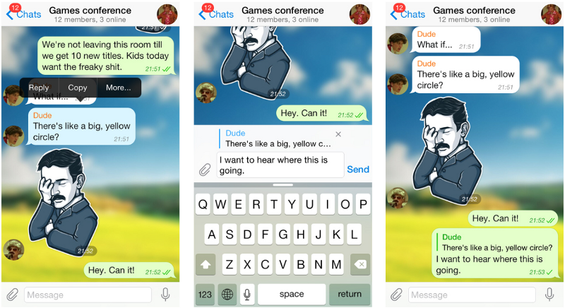
Even Facebook sought a few ways before implementing recently the “reply” feature on posts where you can directly reply to someone and create a 2 levels thread. Into a group chat, that’s even a trickier. Every conversation is happening at the same time and it is hard who is replying to whom. Telegram did a fine job by including the REPLY feature where you can tap on a message and reply to it. It’s using the metaphor previously used in the forum where you first show the original message and then the second user’s answer. It’s clearly a step in the right direction, and I think we can continue to work on that.
-
Mention to grab the attention of a specific Person
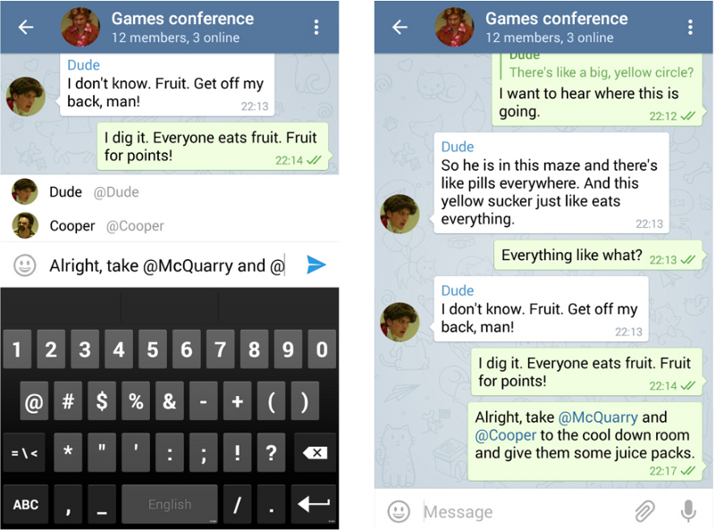
When you are associating with so many people, you need a way to direct your message specifically to someone or to a bunch of persons. Here again, we have a good decade of experience with the @ symbol that is used in a lot of digital products now. So it appears pretty natural to incorporate the mentions into group chats.
Telegram again thinks so too. And it’s interesting how they incorporated the mentions @ symbols that go beyond the notifications settings: if someone sends a message you won’t get an alert but if this message adds your name with the @, you will get a notification. A great rule to make sure important message is not missed.
-
Smart Mute System
One big hook point in group chats is the notifications. You should always give an option to mute conversations. It could be a specific conversation group or person or for the whole app. More precisely you can get the better notifications rate you will get. Dream feature? Link the calendar so everytime you have a meeting, the app is going to mute automatically.
-
Stickers
Now, most of the people are communicating through Emojis and Stickers a definite way of communication that was almost replacing the actual words. If you want a group chat that sticks to people you need to give them fun stuff to share stickers, emojis, viral videos, GIFs, etc… They will stay where they can share those stuff very fastly and if they are the most accurate to what they wanted to share. The reason someone would share on a chat to make some friends laugh, that is people want some fun.
-
Like a message Feature
It’s better if you let the other users that someone liked their message or picture they posted. This is not new as we like more stuff on Facebook for many years. I strongly consider that we are saying a lot by just tapping the like buttons or just adding an emoji instead of a full reply with words. We said to the other person that we care, that we are here and like their stuff. That’s already far more than most communications we can get usually in real life. Be proud of your features and display them when you know they will be useful to your users!
-
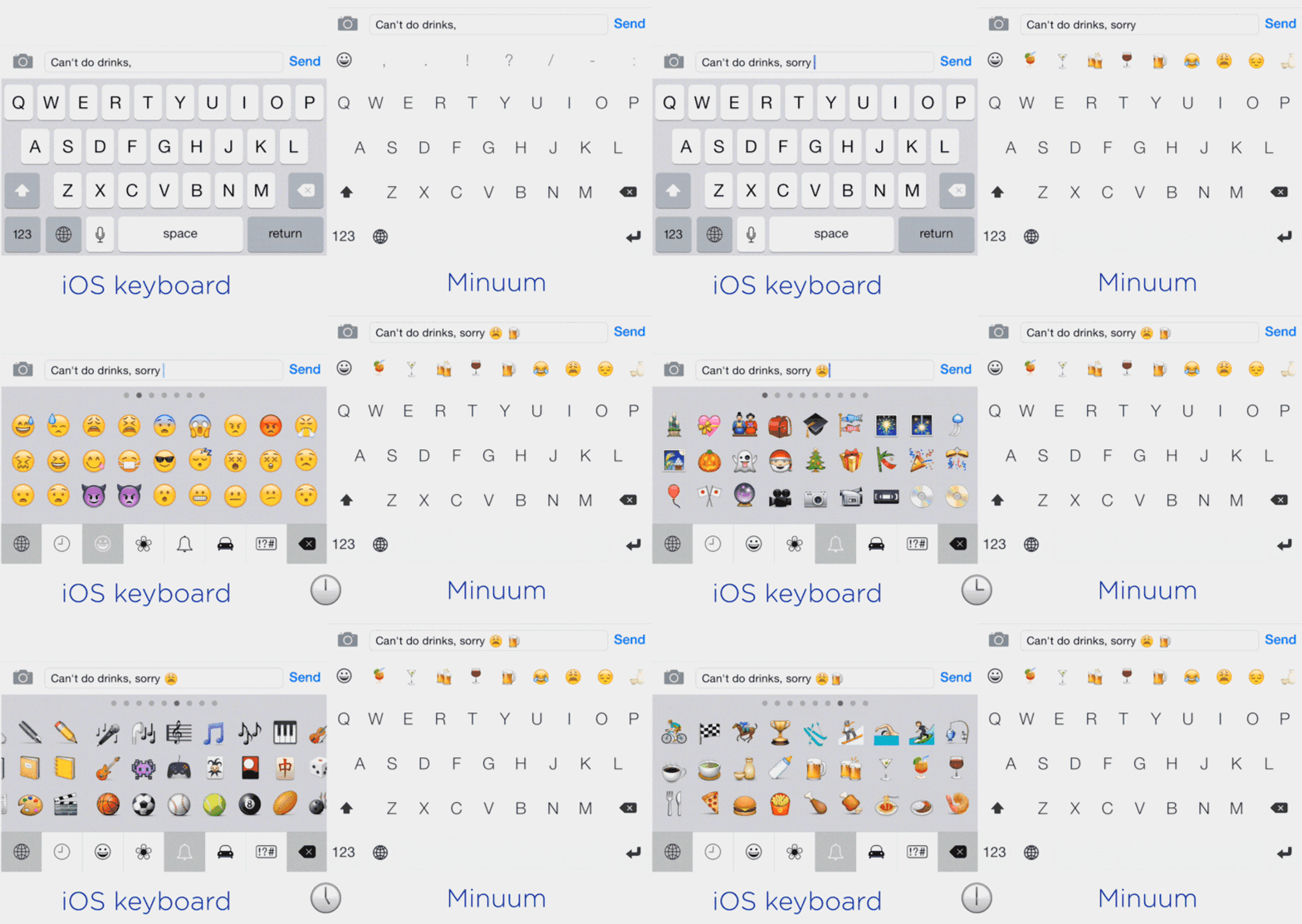
Smart emoji Suggestions
Let’s talk about Emoji, we are totally learning a new language. Cavemen were doodling stick figures to share their experiences or their feelings. We too do the same, except our cave designs are on a smartphone screen.
-
Quick Access to share the pictures, videos or screenshots
We always love to share a bulk of stuff on chats. This includes viral videos, GIFs and also screenshots. We share screenshots a lot. More often than actual URL. How the screenshots are shared on an Instagram picture instead of sharing the link to this Instagram picture.
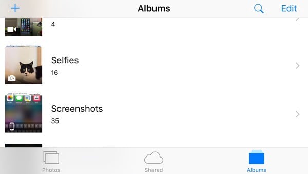
Take a screenshot, as fast as you would blink, and share it with your crowd. iOS 9 release has got this feature inbuilt right by ordering the photo folders by Selfies and Screenshots. It makes the sharing way faster. Dream feature? Take and share a screenshot directly from the app itself.
-
GIF Library
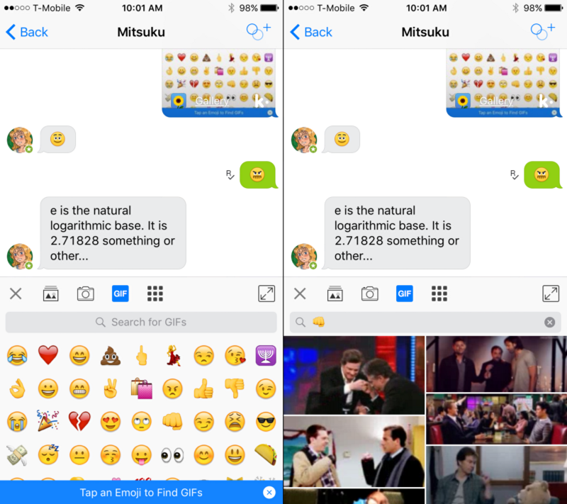
GIF had become the new kid from past years. A lot of messaging apps introduced GIF library but very few of them did a very good work. It’s usually untidy and very slow. The best prof a GIF gallery was by Kik. searching for a GIF can be painful. You would know which feeling or expression you want to convey but it’s often hard to describe it with words. So Kik did an excellent job with their “Tap en Emoji to find GIFs”. Because we are so familiar with Emoji right now that w know which Emoji will describe our feeling, so why not using them to search GIFs? It works Perfectly!
-
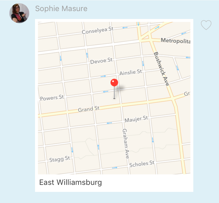
Share Location
Apple added this feature a while ago. But it’s a kind of hidden on the details of the chat itself and it’s super slow to be triggered. Other apps seem to do a better job, which is critical on this situation because you want to share your location right now and if it takes longer than actually typing the address, you missed the point.
Best UI/UX for Group chat app Lots of new features enclosed inside chats will come on our hands, that’s for sure. Facebook Messenger is already on its way with their dedicated app store inside the chat menu. Everyone wants to be part of it to leverage the incredible numbers of users that are on Facebook and Facebook Messenger.
For product designers, our goal will be to find the right balance between matching the user’s actual behaviour and need with business models that want to get their money out of this expanding market that messaging apps are. Contact us today for Best UI/UX for Group chat app at krify.


