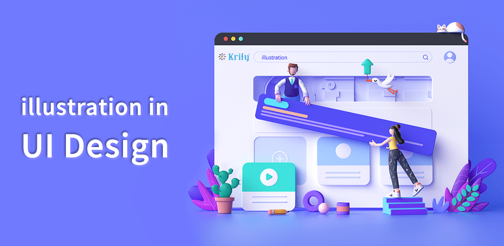
Illustrations are the most influential representations of all time, with the ability to convey hundreds of words (an illustration is worth a thousand words). Designers can make their designs more visually appealing and attract more users by using illustrations.
Designers use illustrations to illustrate complicated things with just a simple illustration. We, humans, love illustrations. It’s in our psychology. And now designers have the ability to incorporate this work of art into their work to make it even better and most designers are doing so wisely. Well, let’s take a look at some of their illustrations to be inspired and learn more about how to use illustration in UI design.
Uses of illustrations:
Because illustration is so simple and appealing, many companies have begun to use it in ads as well, but for now, let’s just concentrate on UI design.
#1 Onboarding Screens:
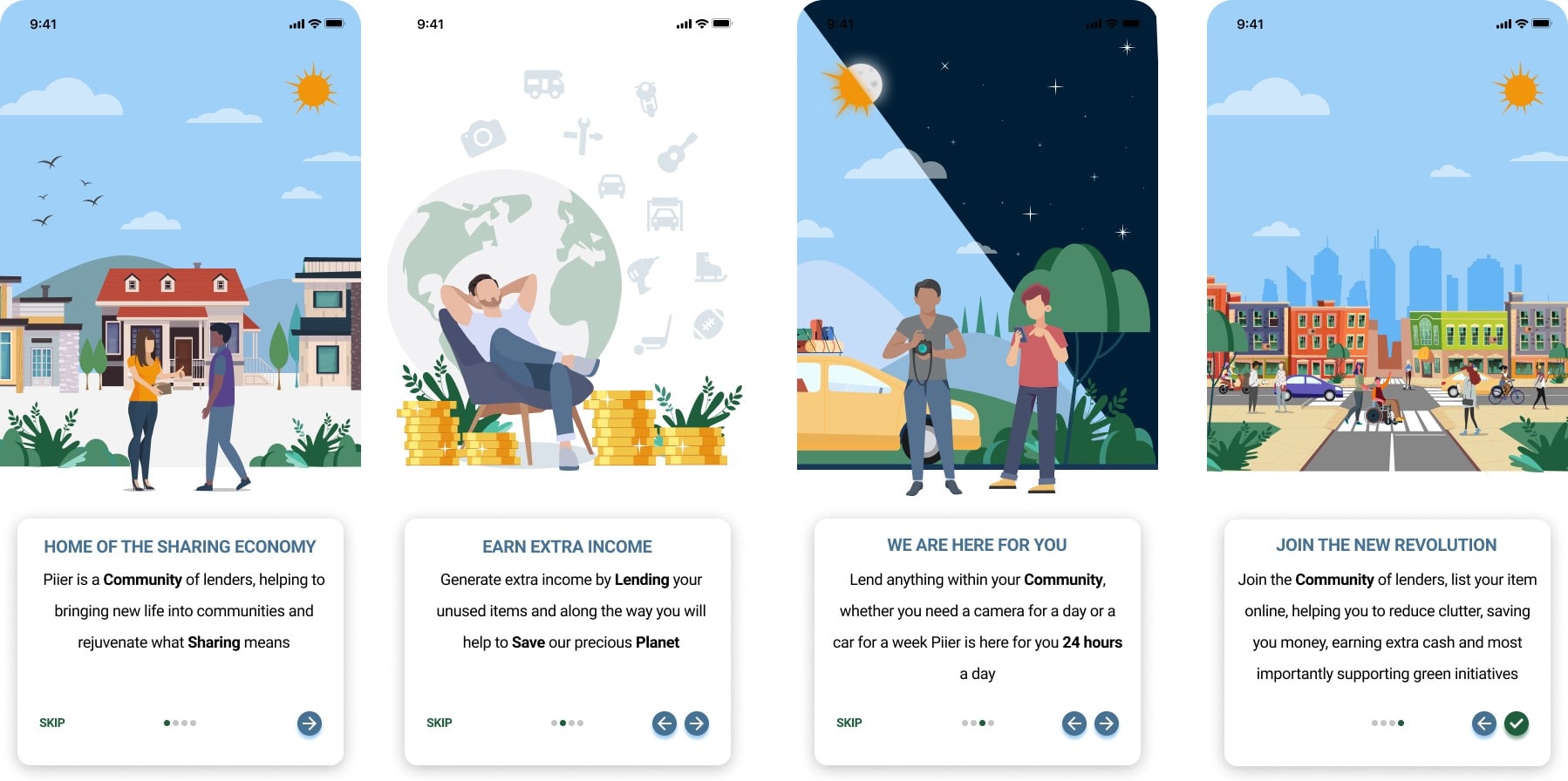
Using illustrations on the onboarding screen improves not only the first impression but also the ability to explain more complex concepts with only a single illustration.
Take a look at this simple onboarding screen, which uses simple illustrations to express complex concepts like Sharing, Earning Income, Community in such a way that you can understand the concept just by looking at the illustrations.
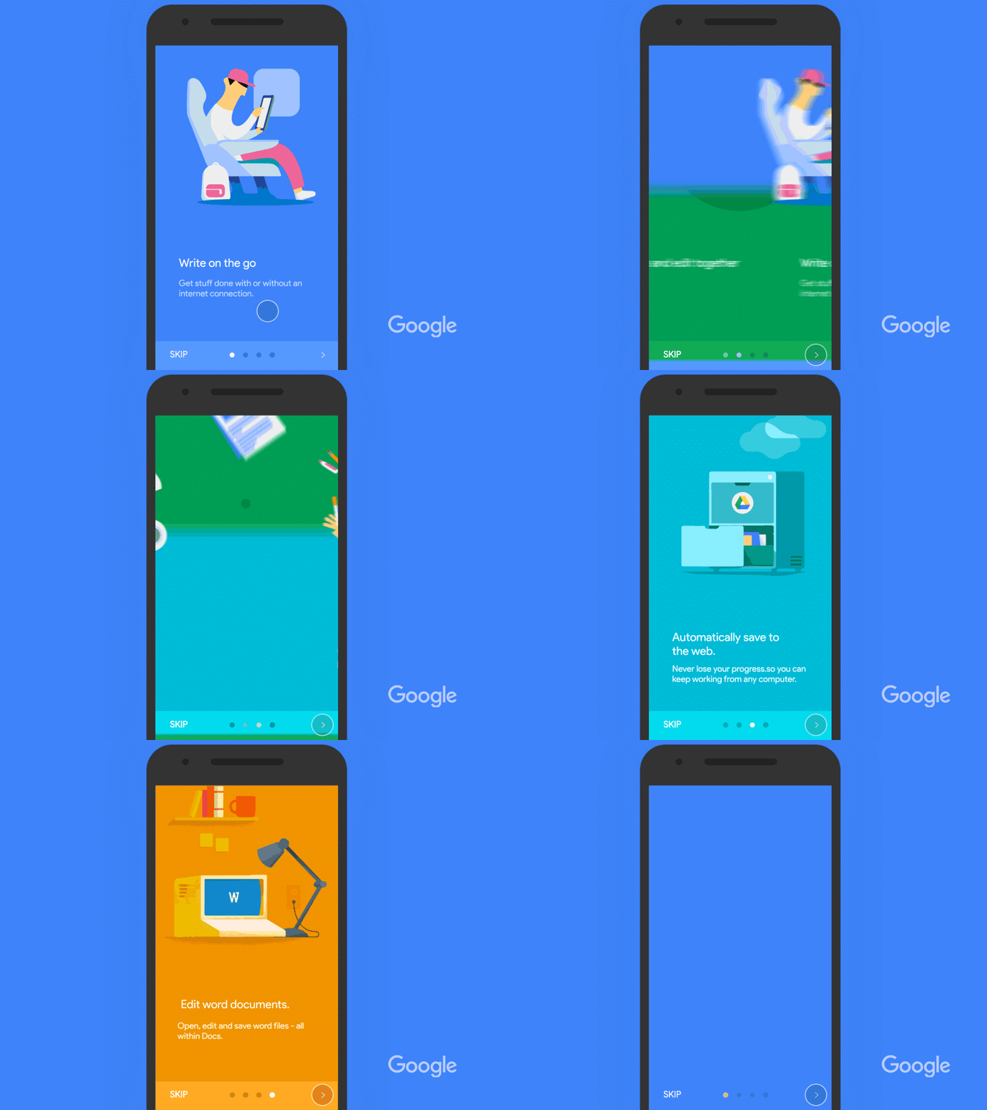
Google also uses its own illustrations on its Onboarding Screens to make them more appealing and to clearly explain their concept.
You can accomplish the following by adding illustrations into your onboarding process:
- Make a strong first impression that the user will remember.
- Assist in the user’s interaction with the application. and the user does not exit the application pretty quickly.
However, I recommend that you avoid using stock illustrations for your UI design. If you have a budget, you can create your own illustrations. If not, you can hire a few great illustrators from Krify, which is a very simple and effective option.
#2 Landing Pages:
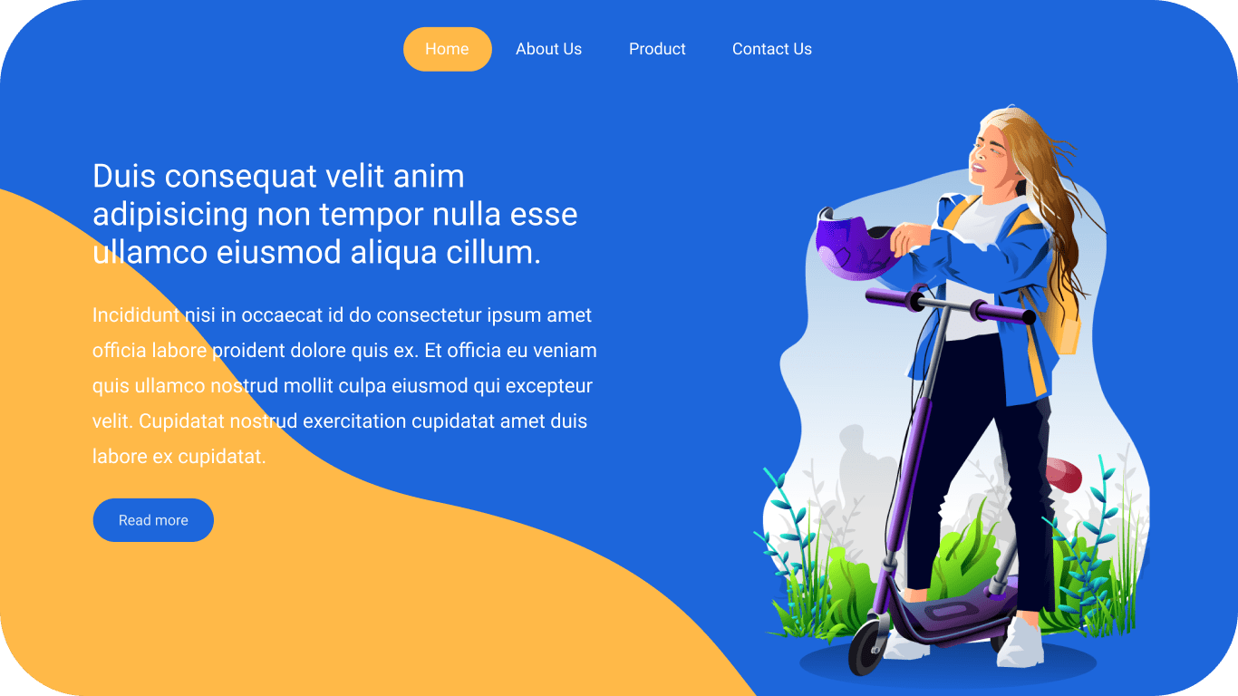
Many designers started using illustrations on landing pages because they give a simple website a new attractive look.
The illustration can also be used as a hero photograph to assist the user understand the call to action. The illustration drives the user to see the main part of the website, just like in the above landing page by Krify.
#3 Branding:
Illustrations can also help with branding, as you can take your brand to the next level by creating a custom illustration or illustrated character.
Google is the most well-known example of branding, as it uses illustrations such as the Google doodle, which are designed in their brand colours. However, Google is not the only example of using illustrations.
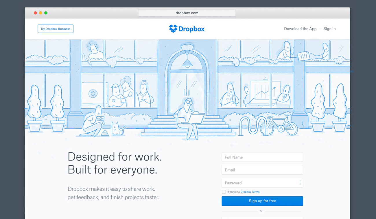
DropBox also uses these kinds of illustration.. and it also creates a brand among the audience.
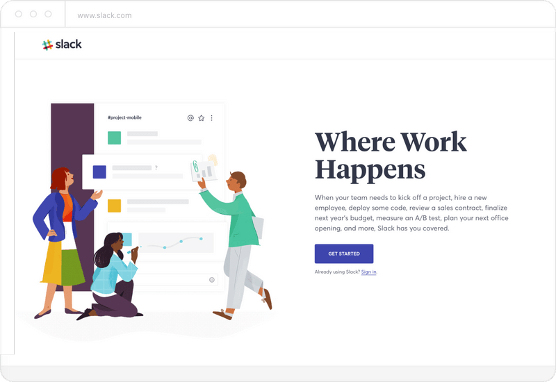
Another famous example is Slack, which uses custom-made illustrations into its design, which not only promotes in conversation but also in branding.
So those are some of the ways to use illustrations. Yes, there are a variety of other choices… and, illustration can be used anywhere in the design where you want to communicate ideas simply.
Conclusion:
Krify is expertise in creating custom illustrations for web applications, mobile apps, storytelling and e-books and for ads and motion graphics. If you are looking for illustration and UI design for your project, you are on the right page. For more information, contact us.


