


Imagine if you were trying to read a book, but the words were too small, or the pages were so shiny you couldn’t see the text. Frustrating, right? This is what the internet can feel like for people with disabilities if websites aren’t designed with them in mind. That’s where the WCAG guidelines come in!
What are WCAG Guidelines?
WCAG stands for Web Content Accessibility Guidelines. These are a set of rules that help make websites usable for everyone, including people with disabilities. Think of them as a recipe for baking a cake that everyone can enjoy, no matter their dietary needs.
Why Are WCAG Guidelines Important?
Just like ramps and elevators make buildings accessible for people who use wheelchairs, WCAG guidelines ensure that websites are accessible for people with different needs. This includes people who are blind, deaf, or have other physical or cognitive disabilities. The goal is to make sure everyone can access information and use online services without barriers.
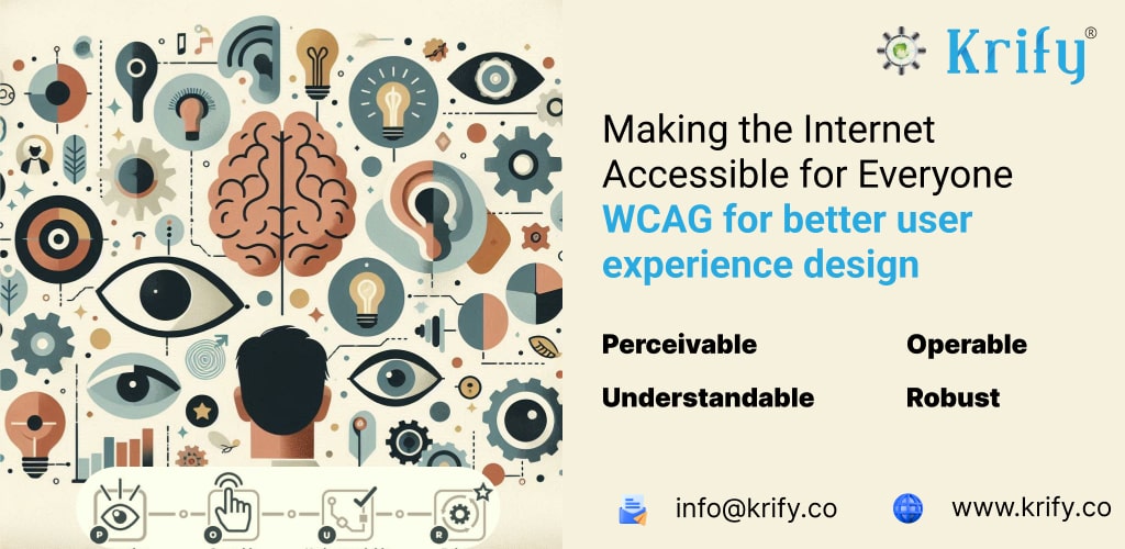
The Four Principles of WCAG
The guidelines are based on four main principles: Perceivable, Operable, Understandable, and Robust. Let’s break these down with some simple examples.
1. Perceivable
This means that users must be able to perceive the information being presented. If they can’t see, hear, or otherwise sense the content, it’s not accessible.
Example: Imagine you’re listening to a song but the volume is turned all the way down. You can’t hear it, right? For a website, this means providing text alternatives for images so that screen readers can describe them to visually impaired users.
2. Operable
Users must be able to operate the website. This includes being able to navigate the site and use all its features.
Example: Think about playing a video game where the controls are too complicated. It would be hard to play, right? For websites, this means making sure all functions can be used with a keyboard alone, which helps people who can’t use a mouse.
3. Understandable
The information and operation of the user interface must be understandable. If users can’t understand it, they can’t use it.
Example: Imagine reading instructions for a game but they’re written in a language you don’t understand. You wouldn’t know how to play. On a website, this means using clear and simple language and explaining any unusual terms or abbreviations.
4. Robust
Content must be robust enough that it can be interpreted reliably by a wide variety of user agents, including assistive technologies.
Example: Think of a recipe that works with any brand of oven, not just one specific type. For websites, this means ensuring content works well across different web browsers and devices, and with assistive technologies like screen readers.
Simple Tips for Making Websites Accessible
- Use Alt Text for Images: Describe what’s in your images so that screen readers can explain them to users who are blind.
- Ensure Good Contrast: Make sure there’s enough contrast between text and background colors so people with low vision can read the content easily.
- Keyboard Accessibility: Make sure users can navigate your site using only a keyboard. This helps people who can’t use a mouse.
- Transcripts for Videos: Provide written transcripts for videos so people who are deaf or hard of hearing can read what’s being said.
- Simple Language: Use clear and simple language to make your content understandable for everyone.
How WCAG useful for Deuteranopia, Protanopia, Tritanopia color blindness people
Color blindness is a condition where people have difficulty distinguishing certain colors. There are different types of color blindness, including Deuteranopia, Protanopia, and Tritanopia. Let’s see how the Web Content Accessibility Guidelines (WCAG) help make the internet easier to use for people with these conditions.
What is Color Blindness?
- Deuteranopia: Difficulty distinguishing between red and green. It’s the most common type of color blindness.
- Protanopia: Another form of red-green color blindness where red looks more like beige or gray.
- Tritanopia: Difficulty distinguishing between blue and yellow. This is rarer than the other types.
How Do WCAG Guidelines Help?
The WCAG guidelines include specific recommendations to ensure that people with color blindness can use websites effectively. Here’s how:
1. Color Contrast
People with color blindness can struggle to read text if the contrast between the text and the background is not sufficient.
Example: Imagine reading light gray text on a white background. It’s hard to see, right? WCAG recommends a contrast ratio of at least 4.5:1 for normal text to ensure readability. This helps people with Deuteranopia, Protanopia, and Tritanopia to distinguish text from the background.
2. Avoiding Color-Only Cues
Information should not rely solely on color to convey meaning. For example, using only red text to indicate an error can be problematic for someone with Protanopia.
Example: Instead of using just red text to highlight errors in a form, use an icon (like an exclamation mark) or additional text to explain the error. This ensures that even if the color isn’t seen correctly, the message is still clear.
3. Text Labels and Descriptions
Ensure that buttons, charts, and other elements have text labels or descriptions that don’t rely on color alone.
Example: In a chart, instead of using only colored lines, use different patterns (like dashed or dotted lines) and labels to differentiate them. This way, even if someone can’t see the colors correctly, they can still understand the information.
4. Alternative Text for Images
Provide alt text for images to describe what’s in them, especially if the image contains important color information.
Example: If an image shows a red traffic light, the alt text could say “red traffic light.” This helps users understand the content even if they can’t see the color.
5. Designing with Patterns and Textures
Use patterns and textures in addition to color to convey information.
Example: Instead of just a green button for “go” and a red button for “stop,” use a checkmark on the green button and an “X” on the red button. This helps everyone understand the function of the buttons, regardless of their ability to see color.
Simple Tips for Designing Accessible Websites
- Check Color Contrast: Use tools to check the contrast ratio of text and background colors.
- Don’t Rely on Color Alone: Use shapes, patterns, and text to convey information.
- Provide Text Descriptions: Use alt text for images and clear labels for buttons and charts.
- Test with Color Blindness Simulators: Use tools to simulate how your website looks to people with different types of color blindness.
Why Should We Care?
Making the internet accessible isn’t just the right thing to do; it’s beneficial for everyone. When websites are designed with accessibility in mind, they are often easier to use, more user-friendly, and better for search engines.
In Conclusion
The WCAG guidelines are like a guidebook for creating websites that everyone can use, regardless of their abilities. By following these guidelines, we can make the internet a place where everyone feels welcome and included. Just as we wouldn’t want to exclude anyone from a game, we shouldn’t exclude anyone from accessing information and services online.
So, let’s build a web that everyone can enjoy, just like a delicious, inclusive cake that everyone can share!
At Krify, our expert UI/UX designers are dedicated to delivering superior design solutions for your projects. Contact us and hire our talented UI/UX designers to elevate your user experience and interface design.