The Latest UI/UX Mobile App Design Trends
UX/UI design for any mobile is the primary factor that makes app either gorgeous or frustrating. ‘Customer Experience’ is the most influential buzzword of 2015. Smart companies always go with their distant vision and hence always focus on delivering outstanding customer experience all along. Eventually many businesses have caught on the importance of following this practice and hence always prefer for going the designs. In present scenario, designs have become the primary language of business.
Apart from excellent customer experience the other important roles played by perfect UX is associated with delivering services and products, driving company growth and fostering innovation.
Let’s reflect on latest designing trends for apps and screens.
Power of simple navigation
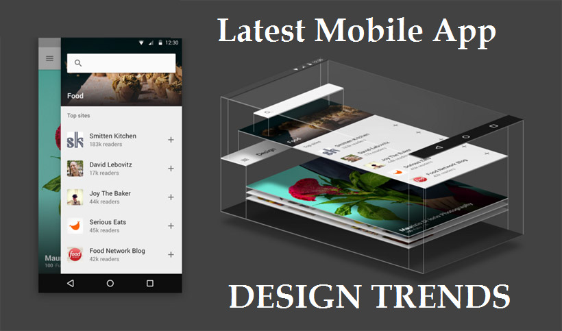
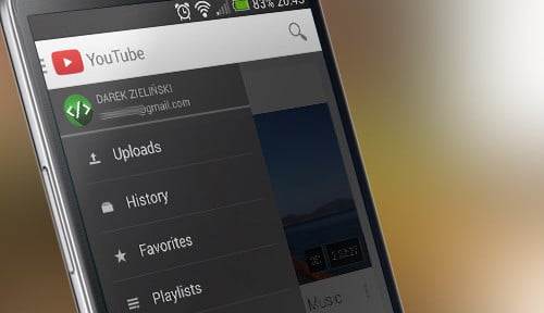
Studies show that most of the mobile users love simple navigation. Mobile apps with clean interface, clean typography and pleasant aesthetics are the one liked by users the most. Rather than gaudy elements easy drop down menus or sub menus sliding out from side of the screen is much appealing. Considering the increasing number of potential mobile shoppers and app users, designers have to think to make mobile apps those are easy to use for customers and visitors. It should easily convey the information. Simple navigation surely leads to uninterrupted, user-friendly and smooth user experience.
Interactive designs (storytelling) is next big thing
Mobile apps are successful only if they are focused around users. Interactive designs is the key to draw in more and more customers and users. Integrating interactive elements with powerful and interesting visual story will lure the customers. The shift towards storytelling through interactive designs has become a primary way to capture investor’s attention as well as more consumers/customers. Short and digestible user-driven stories is the optimal way.
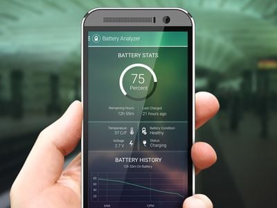
Use of Diffused Background
Diffuse background was a big hit among website designers in 2015. Diffused background became popular as it helps designers to make call to action button readily accessible and visible. The call to action button is responsible for lead conversions on your website or mobile app.
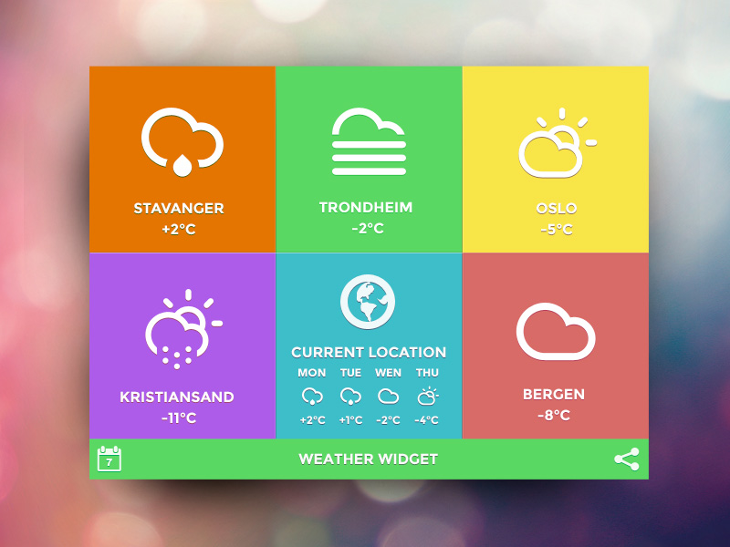
Fresh and Rich Color Palettes
Flat design mobile apps are usually associated with minimalist, subtle color schemes with lot of white space. But in 2016, simple colors and soft contrats are being rapidly replaced by new color palettes that focus on both dark and light backgrounds.
Material design focuses on more contemporary colors inspired by unconventional sources like pavement making paint, architecture, athletic courts, etc. App designs are seemingly moving away from monochromatic colors to vibrant and diverse color palettes.
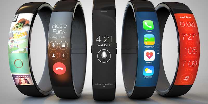
Designing for Wearable Technology
With the rapidly growing wearable market, app designers are keenly working towards developing mobile app designs that works for these lucrative wearable devices. Wearable app designers prioritize the ways users interact with their wearables.
- Primary design principle for wearable apps is ‘glanceability’. The UI should be designed in a way to completely focus on presenting only the information that user is required to see in an easy to interpret manner within a single glance.
- Incorporating gesture-driven activation of certain features accentuate the advantages of wearable devices, so designers need to design keeping it in mind.
These trends share the common goal of crafting mobile apps that are engaging and more accessible for today’s consumers.
Let’s check out some of the examples of latest design trends:
-
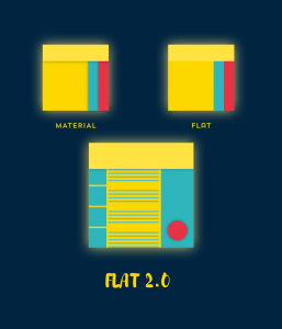
Flat design 2.0
As many designers are recognising the usability flaws of flat design, its more advanced version, called ‘Flat 2.0’ or ‘Almost Flat’ design has evolved. It is the most elusive evolution of flat design as it strikes the fine balance between sufficient changes to improve user experience and staying true to its original principles.
-
Motion
2D animation and cinemagraphs brought photos and illustrations to life. A small flicker of movement is sufficient to catch visitor’s attention without distracting from content. It is a hybrid of motion and still.
-
Rich Colors
As per present scenario, choice of colors are bright pastels and bold and rich accent colors. The words of the Pantone Fashion Color Report for Spring 2016 are as follows: “A happier, sunnier, place where we feel free to express a wittier version of our real selves”.
Let’s check out the top 10 2016 Spring colors as per Pantone, which are:
In the world of designs, things change as per the demands for it. Somebody will notice what is lacking in the present thing and will find out ways to improve it, to take it another level. Thus trending and latest and at the same time user-friendly, is always perceived well by audiences and users of mobile apps. The shift and evolution will continue.
We, at Krify, believe in delivering the best UI/UX solutions for mobile, web and wearable apps. Our expert team of designers are in sync with latest trends and evolution in designing for mobile as well as web. Reach us today for impressive and user-friendly design solutions.


