


The Growing Challenge:
Day by day, the number of devices, platforms, and browsers that need to work with your site grows. With the introduction of many tablets, tons of new internet accessible devices, smartphones and technologies, We have been faced with designing for more monitor resolutions and devices than ever before. This acceleration of users accessing Web content from mobile devices rather than traditional desktop and laptop computers has posed a difficult challenge to business owners as well as webmasters in presenting the websites to mobile visitors.
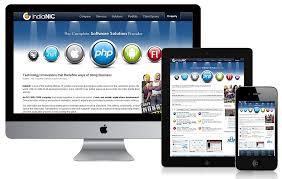
Responsive web design represents a fundamental shift in how we’ll build websites for the decade to come. Responsive websites respond to the device that accesses it.
Rather than designing multiple sites for different-sized devices, Responsive Web design fluid layout approach designs one site but specifies how it should appear on varied devices. Responsive Web design has emerged as both one of the hottest trends in Web design and development, as well as the preferred method to address these challenges.
What is Responsive Design?
Krify website as seen in iPhone4S, Safari
Let’s just get right into it: Believe it or not, the Krify corporate website & blog that you’re reading this article on is actually a Responsive design! To see it in action, open this article on a desktop browser and slowly make the browser thinner and wider. You should see the layout magically adjust itself to more comfortably fit the new width of the browser, even if you make the page as skinny as the resolution of a mobile phone.
Responsive web design is not a single piece of technology, but rather, a collection of techniques and ideas.
(i) Fluid Grids: Responsive design’s first key idea involves using fluid grids, which surpass traditional liquid layouts. Rather than basing the design on rigid pixels or arbitrary percentages, designers carefully proportion fluid grids. This ensures that when a layout adjusts to different screen sizes, all elements resize proportionally.
(ii) Media Queries: The second part of responsive design is CSS3 media queries, which currently has great support across many modern browsers.
Advantages of Responsive Web Sites
- High Usability, Intutive, and Intractive
- Lower Maintenance costs for website owners
- Brand consistency
- Fast Load Time
- No redirects Web is going responsive
Many businesses and companies are rapidly migrating their websites to Responsive. Here are the examples of couple of responsive websites.
and plenty more !!! Let us redesign your existing website into a Responsive Design !
At Krify, We have passionate design team specialized in HTML5, CSS3 with responsive fluid design skills. We can convert your existing websites into niche Responsive websites. Send us a message from our Contact Page with your website link, and then we will help you the rest of the process.
[/text_dd][/column_dd][/section_dd]