Browsing something on internet or operating a website is not always an easy task for everybody. Inaccessible design of web pages prevents millions of people with disability from an easy user experience.
Accessibility Statics
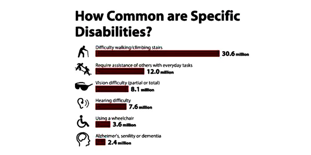
3.3% terms to 8.1 million people have vision impairment these people mostly rely on screen reader or screen magnifier.
3.1% terms to 7.6 million people having hearing impairment these people mostly rely on audio and video media.
For those people with visual impairments, hear loss, difficulties in learning and many more.
Making website more accessible for disabled user building a disability friendly website is lot very easier than you might think. If you can follow few basic steps termed below.
(i) Usage of Alt tags
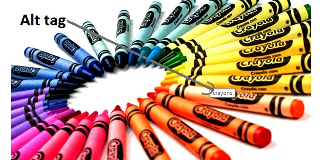
The ALT tag provides an alternative title for the image if a user with visual impairments uses a screen reader. Alt tags are read aloud, providing alternative information for an image.
Consider Alt tags seriously use them and describe an image succinctly. If it is a picture of a book, write out the book’s name. If it is an object describe what it is for eg, if it is a set of crayons, alt text used can be “crayons” as illustrated below in the image.
(ii) Include transcriptions and subtitles
If your website includes videos, providing subtitles if there are bulk uploads of videos of Your own kind. Youtube the popular video hosting have tools which allows users to add Their subtitles to the clips.
Transcription of videos is always helpful for the users. Providing a text transcript makes the audio information accessible to people who are deaf or hard of hearing, as well as to search engines and other technologies that can’t hear.
It’s easy and relatively inexpensive for websites to provide transcripts. There are also transcription services that create text transcripts in HTML format.
(iii) Make your body text legible
The 0.8 em default on some blog platforms is just too small for millions of readers out there. Usability should always be your paramount concern as not all the Readers are under 25.
(iv) Color control
This main focus on people having color blindness choosing smart color combination is useful for any website with any kind of audience. Reducing the use of red, green or blue light (will especially help colorblind users). White background with black text is one good practice as it readable for all audience. (below is an illustration of color control).’
(v) Use links
Make your links look like links.
Use colors, underline to distinguish links from regular text. Describe the links that is given instead of writing click here use description for link eg. best software technology company Krify .
So that is where the accessibility of the website gets increased for various kinds of people.
(vi) Variable font size
Make sure of your font sizes. If the font size is fixed, older browsers do not allow user to adjust the size of the text. (Now IE, Firefox you can give command + or – to increase or decrease the size of the text on screen.)
(vii) Keep your website simple
Though useful for any audience, the primary focus is on the elderly or those with learning disabilities. You can simply break down content on a highly filled website, such as “about us” or “home,” to enhance accessibility.
(viii) Abbreviations and Document structure
A very general rule is that more structured document is easier to understand. Using headlines, bulleted, number list and indented quotes will make the website more accessible
Abbreviation: always expand the very first occurrence of all abbreviation and also use the period of abbreviation.
(ix) Know your audience
If you are passionate about highly accessible site. Knowing your audience and designing a website is truly required.
The above steps and tips will give out an idea of how to design an website for disabled people.


