


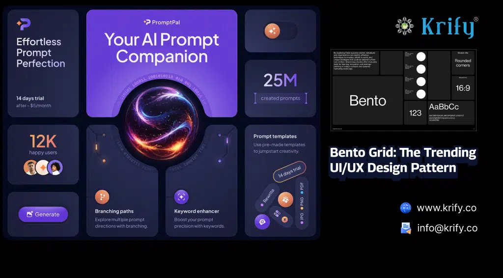
Bento Grid, inspired by the Japanese Bento Box, is a modern UI design trend that organizes content into visually appealing, asymmetric grids. It provides a structured yet flexible layout that enhances user experience, readability, and aesthetics. Popularized by Apple’s macOS and iOS design systems, the Bento Grid is widely adopted in dashboards, portfolios, and mobile applications.
Why Bento Grid is Trending?
1. Visual Hierarchy & Readability
Bento Grids allow designers to emphasize important content by varying the size and placement of elements, ensuring a clear visual hierarchy.2. Asymmetry & Aesthetic Appeal
Unlike traditional grids, Bento Grids offer an asymmetrical yet balanced approach, making UI layouts more engaging and visually dynamic.3. Improved User Experience
With structured yet modular layouts, Bento Grids make navigation intuitive, especially for dashboards and content-heavy interfaces.4. Flexibility Across Devices
Bento Grid adapts well to both web and mobile layouts, ensuring a seamless, responsive experience.Where Bento Grid is Used?
1. Dashboards & Data Visualization
- Bento Grid helps in presenting key performance indicators (KPIs) and analytics with varying tile sizes.
- Example: Apple macOS Widgets
2. Portfolios & Personal Websites
- Creatives use Bento Grids to showcase work dynamically while maintaining structured layouts.
- Example: Dribbble Portfolio Designs
3. E-commerce & Product Pages
- Online stores use Bento layouts to highlight featured products, offers, and recommendations.
- Example: Nike’s Product Page
4. Mobile Apps & Widgets
- Apps utilize Bento Grid to arrange content in an intuitive and visually rich way.
- Example: iOS Home Screen Widgets
Best Practices for Designing with Bento Grid
1. Define Content Priorities
Decide which elements need the most visibility and allocate larger sections accordingly.2. Maintain Balance with Asymmetry
Even though Bento Grid thrives on asymmetry, ensure a balanced distribution of elements.3. Use Visual Contrasts
Play with colors, typography, and spacing to differentiate sections effectively.4. Ensure Mobile Responsiveness
Optimize layouts for different screen sizes while maintaining grid integrity.Tools for Implementing Bento Grid
- Figma: Figma UI Kits
- Adobe XD: Adobe XD Resources
- Tailwind CSS: Tailwind Bento Grid Guide