A few months ago, the mobile engagement platform localities conducted a survey on 1000 users and it has agreed that push notifications are better designed and accepted today than they were a few years ago. Marketers communicate using mobiles and push notifications became part of our daily lives.
On average impressions on the phone per day is 2617 times and spends nearly 2 hours and 56 minutes on their mobile devices every day, which equates to an approximate of 86 hours/month. What’s worse, we won’t spend to much time communicating through text or by attending calls. More than 90% of our time spent on apps using mobile devices. Most of the apps are specially designed to be attention hogs, using color themes, wording and layouts that make them extremely addictive.
Initially let’s know what is a notification and how they appear on the device?
A notification is a message that android displays outside your app’s UI to provide the user with notes, communication from other people, or other timely information from your app. Users can tap the notification to open or take an action directly from the notification.
In this article, we got to discuss the design and interaction patterns using notification. style API in both mobile and wearable apps.
Appearance of Notification On Devices
The notifications can appear to the user in different locations and formats such as an icon in the status bar, in the notification drawer with clear detailed entry, as a badge on the app’s icon, heads – up notification, lock screen notification, or on the paired wearable automatically.
-
Status Bar and Notification Drawer
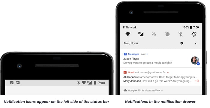
When you get the notification on the phone, it will appear first as an icon in the status bar. The user can swipe down to check the notification drawer on the status bar, where they can view more details and take action with the notification if required. To have an expanded view the user can drag down on a notification in the drawer, that displays the additional content and action buttons if needed. A notification remains visible in the notification drawer until the user or app dismiss.
-
Lock Screen
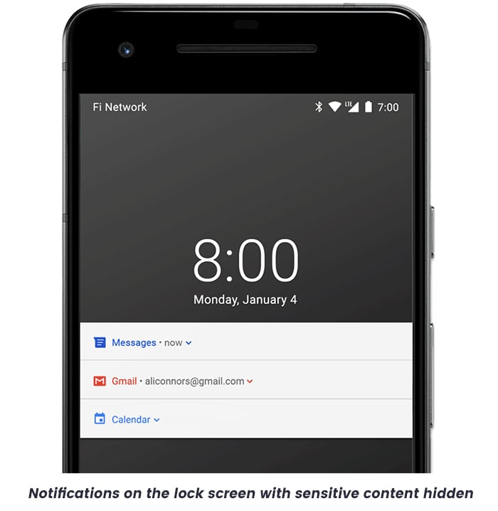
Beginning with Android 5.0(Android API level 21), notifications can appear even on the lock screen. You can even programmatically set the level of notification details to display on the lock screen by the app or whether to display the notification on the lock screen.
In user point of view, using the settings user can choose what sort of data to display in lock screen notifications, including the option to disable all lock screen notifications. While in Android 8.0, users can choose to disable or enable lock screen notifications for each notification channel.
-
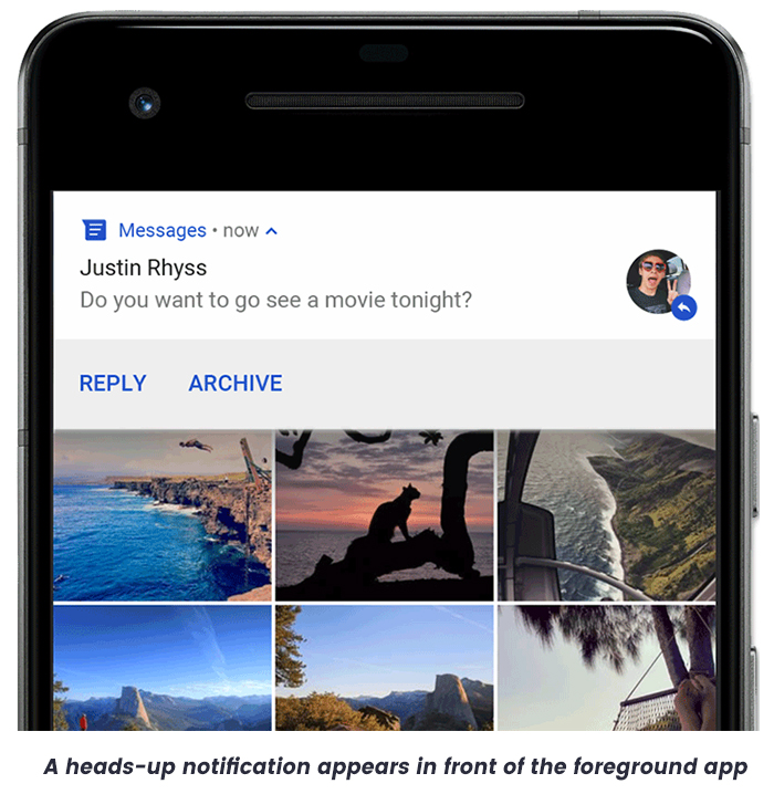
Heads-up Notification
Beginning with Android 5.0, notifications that can temporarily appear in floating windows called a heads-up notification. This way is normally important for notifications that the user should know immediately, but this will allow the notification to appear only if the device is unlocked. This heads-up notification appears for a moment and disappears, but it will be visible in the notification drawer.
The conditions that might trigger the heads-up notifications include the following
- The app uses fullScreenIntent when the user activity is in full-screen mode.
- When the device running with API level 25(Android 7.1) or lower, the notifications will be given high priority and even uses ringtones or vibrations.
- While the devices with API Level 26(Android 7.1) or higher, the notification channel has given the high priority.
-
App Icon Badge
In devices running using Android 8.0 (API level 26) and higher, the app icons will indicate the notifications with a coloured “badge” or also known as “notification dot” on the corresponding app launcher icon. The user can long-press on the app icon to see the notifications for the respective app. Users can then ignore or act on notifications from that menu, similar to the notification drawer.
To know more about how badges work, read Notification badges.
-
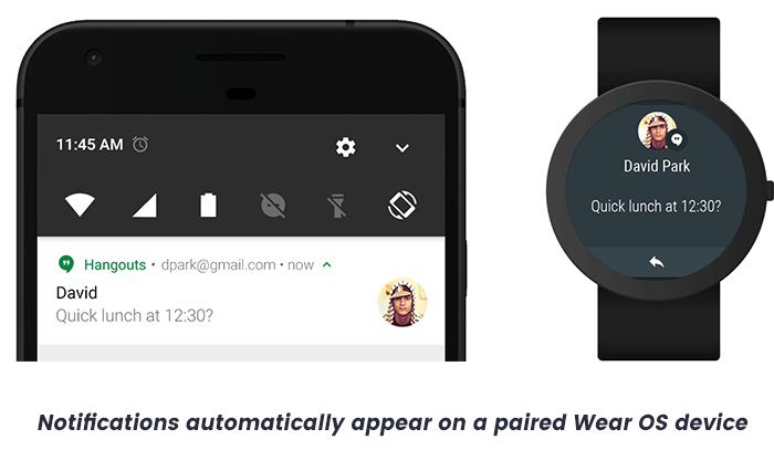
Wear OS Devices
If the user has a matched wear OS device, all your notifications appear there automatically, including expandable detail and action buttons. Even you can enhance the experience by customizing some appearances for the notification on wearables and provide different actions, including suggested replies and voice input replies. You can also follow this here to know how to add wearable-specific features to your notification.
From the above, it was clear about how the android notification style has come up with the icon badges for notifications in the mobile and wearable devices.
As Android is another major platform for mobile devices that uses the material design. Now we go for
4 Enhanced UI trends of 2018
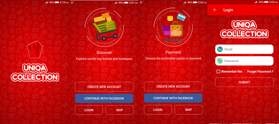
1. Uniqua – An Android Application Template for Your Business
Uniqua is an E-Commerce app template that is used to manage your business. It is a configurable android mobile app which allows you to add multiple categories(shoes, fashions, electronics)of products and subcategories(male, female, kids). It has engaging and animated UI with material design. This app will help you to promote and sell the products.
Special features:
- Full MVP Pattern Code
- Clean and Well Commented Code
- Google AdMob Integration
- Choose Product Size, Increment and Decrement Quantity
- Order Summary
- UI Material Design
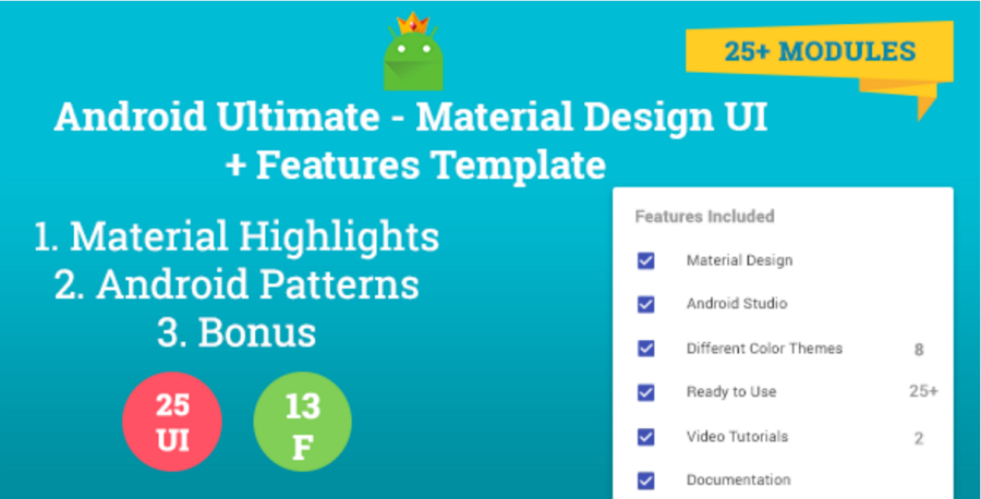
2. Android Ultimate – Material design UI and Template Features
Android Ultimate has over 25+ modules enclosed in a single template. These modules are categorized into 3 sectors, namely material highlights, Android Patterns and Bonus. Every module is carried into the template with a simple demo of the module.
Special features:
- Highlights of Google’s Material Design, as such Toolbar, Tabs, FAB, Recyclerview, Pickers & Dialogs.
- All the usual patterns of Android App, such as App Intro, Login, Pull To Refresh, Textview & UI Elements.
- 8 themes.
- Well Documented. Even Foreign projects are also Documented.
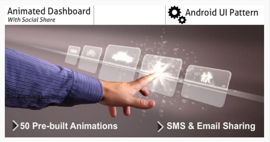
3. Animated Dashboard with social shares
Android animated dashboard pattern UI is created to make any user feel free to use the app easily from the very first screen, with simple navigation. None of the incorporated activities does anything more than display a line or two of the text. This makes it a good starting point for building your own dashboard app. It supports more than 50 pre-built animations that you can choose from your own layout.
Special features:
- 50 pre-built animations
- Share app utility via
- SMS o Email
- Easy customization
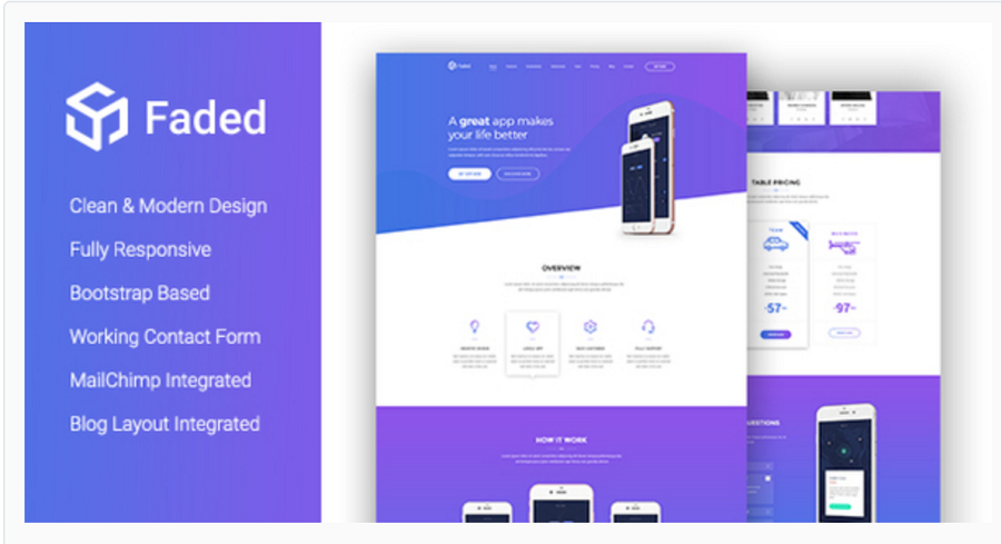
4. Faded – inventive app landing page template with blog
Faded is a modern app landing page template beautifully crafted for use in any related product in the industry, like mobile apps, saas applications, software, digital products even books or magazines. This is done using HTML5, CSS3, JS JQuery and Bootstrap. It is highly responsive so that you can develop your own new and awesome landing page for all types of devices.
Special features:
- Fully Responsive Bootstrap Based (3.x)
- Working Contact Form
- MailChimp Integrated
- Blog, Blog Single Post Included
- Very Smooth Transition Effects
- Super Easy To Customize
- Well Commented Code
- W3C Valid Code
Are looking for mobile app development company based on UK and India for your business apps? Krify is here to assist you in all aspects of your requirements with the most and best that fits for your business. catch us at here


