


Design industry evolves with the lightning speed and to stay in the race it is important to follow the recent industry standards. As a designer or as a leading technology firm into designing, it is important to be aware of the shifts going in the industry, irrespective of whether you want to follow the trend. check out some of the hot and important trends that we should follow in 2017 and implement them. As a designer or mobile UI design trends, it is important to be aware of changing industry standards. Some of the hot & important.
Check out some of the hot and important Mobile UI Design to follow in 2017
- Motion Design
Motion design has begun appearing everywhere, transforming simple app button taps into more meaningful actions.This motion design gives user a focal point and gives an immersive experience to users. Motion design has begun to become a whole new standard for representation of keynote elements.
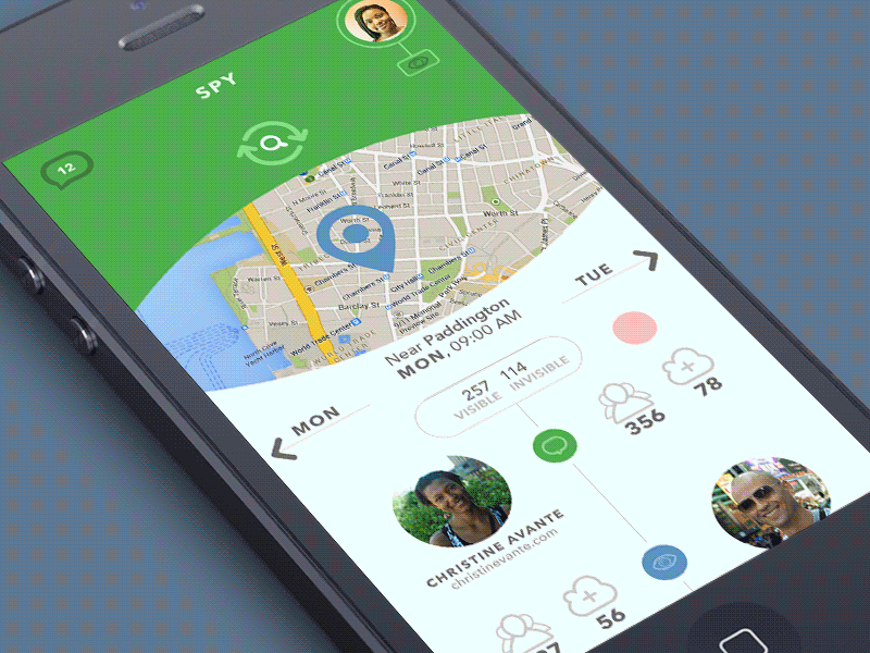
Upgradations of UI for gestures
New interesting gestures have been added to mobile apps with respect to user experience, usability and retention. Implementing gestures in mobile app user experience is crucial for success. Understanding gestures better enhances app focus, speed, and user interaction. Gestures include touch mechanics and touch activities.
Touch mechanics is something which your fingers do on the screen, it include: touch (tap), double touch, force touch, long press, long-press drag, drag, swipe or fling, pinch open, pinch closed, two-finger touch, two-finger long press, Two-finger long-press drag, two-finger drag, swipe or fling, two-finger double touch, rotate.
Touch activities is the result of what is produced by touch mechanics. With the constant visible rise in number of smartphone users, designers need to go design better range of mobile gestures.
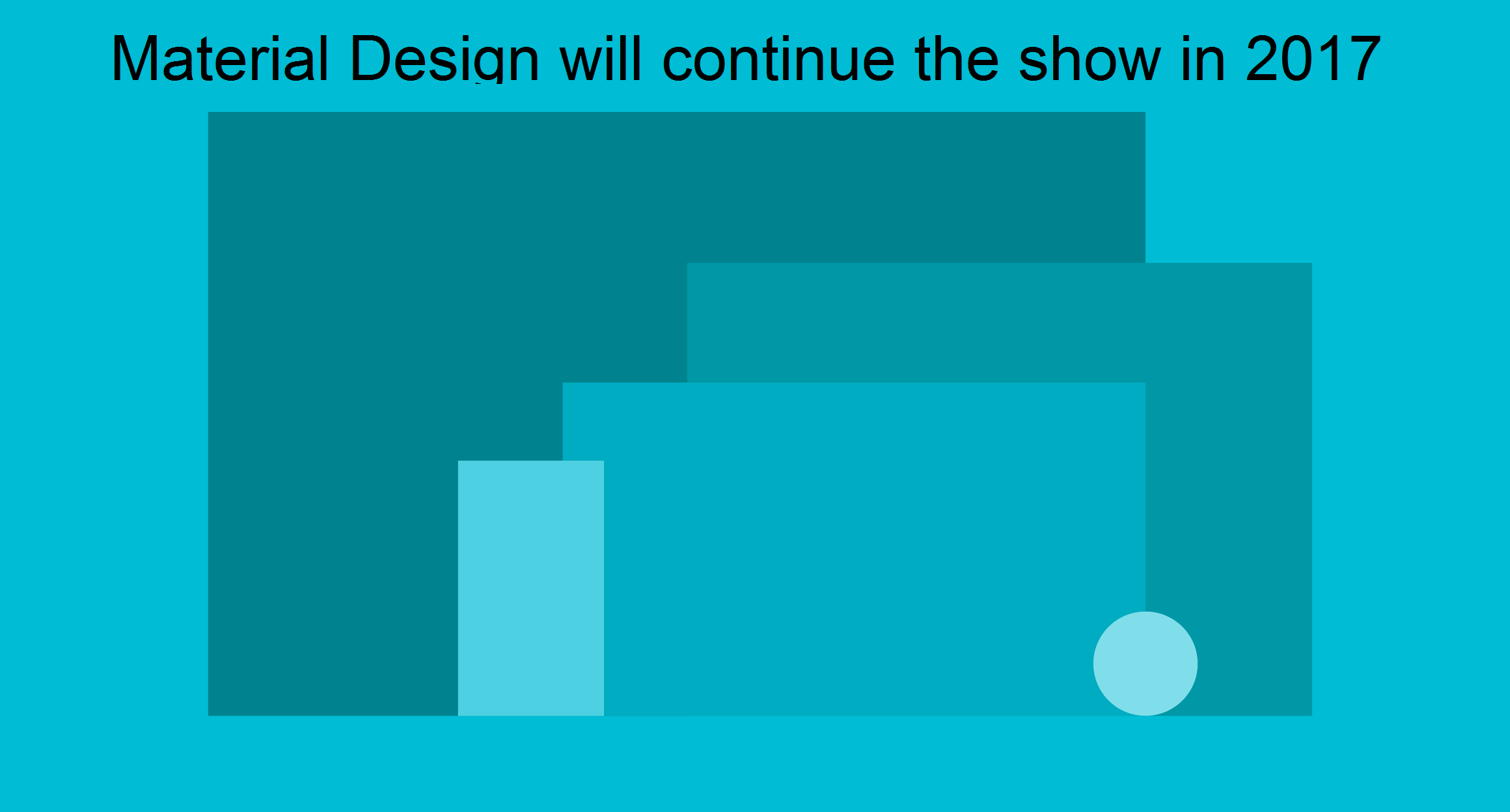
Material Design again
Material Design was hailed as the best design trend in 2016 and is expected to maintain its popularity into 2017 as well. This design approach facilitates the creation of user-friendly interfaces across diverse mobile platforms, streamlining user engagement. Some of the amazing examples are Google Maps, YouTube, Google Drive, etc. which are available for both Android and iOS platforms. Material design uses techniques like shadows, gradients and other subtle 3D effects, rather than being completely flat. This will improve the UX on mobiles considerably well. The adoption of material design was slow in case of various Android apps, we expect to see more popular apps adopting material designs.
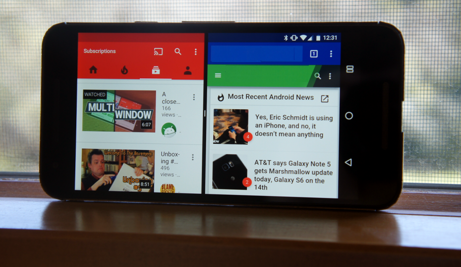
Multi-app Split Screen
The multi-app, split-screen work flow allows you to do multiple things on your screen. This means one can check tweets, do emails and access an app at the time. It saves time and helps in avoiding the trouble of constantly switching between two or more app windows. The iPad Pro has already integrated this feature. Now it’s the time to introduce mobile split-screen on Android devices. Designers and Developers need to focus on producing such multitasking feature for Android.
Passive Color Contrast
In past years, suggestions have always emphasized keeping contrast loud to facilitate reading on screen. But in 2016, this trend started shifting towards more toned contrasts. In 2017, contrast will become quieter and more subtle, enhancing the reading experience and being gentler on users’ eyes.
Rise of Flat Design 2.0
Designers introduced flat design 2.0, refining the flat design by incorporating subtle three-dimensional elements such as gentle highlights, faint shadows, and layered separation. Flat design 2.0 is now like material design in terms of gradients and 3D effects. With the arrival of 2017, more mobile sites and apps will have flat design too but with noticeable gradients indicating subtle 3D elements. This will improve the UI in terms of figuring out for users on where to slide and where to tap.
Personalisation in UI design
We are already aware of the ‘responsive design’, which is all about adapting a layout for various devices of different screen sizes. In 2017, developers are looking at the new concept of personalizing UI. Material Design accommodates varying user needs by adjusting font sizes, minimizing flashing images, dimming screen brightness, and softening harsh sounds. This personalisation of UI can be achieved through the available metadata. This can be gained from the information provided by the user already i.e. on app, on device or on different platforms. Thus 2017, we can expect mobile app UI design to upgrade towards being more personalised and user-oriented than just being device-oriented.
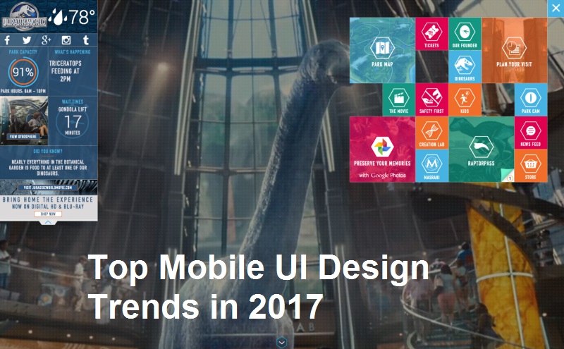
Have a look at some more promising trends of mobile UI designing in 2017!
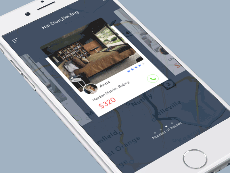
Card Design
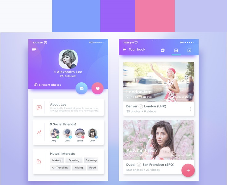
Complementary Gradients in Colors
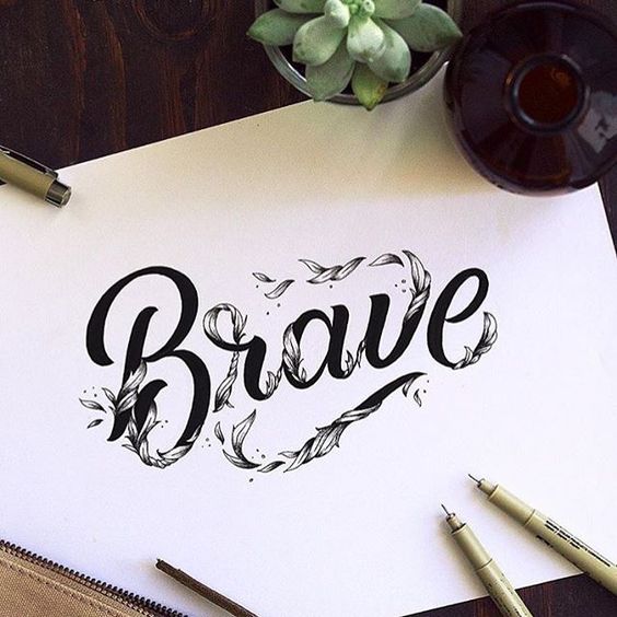
Typography – Font families
These UI design trends are definitely going to shape the future of mobile app designs in 2017 and coming years. Such designs which are more focused on better interface, good and enhanced user experience. Designers need to adopt these trends to sustain in the fast growing market for mobile apps.
Krify is a leading IT solution and services provider with a team of ace designers who stay updated with the designing trends within the industry. We offer web and mobile app design and development services at reasonable costs. Contact us today for free quotation.