


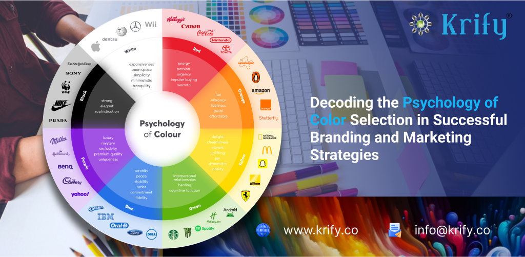
Emotional Response to Color
- Warm Colors (Red, Orange, Yellow):
- Red: Often associated with excitement, passion, and energy. It can also evoke feelings of danger or urgency. Red stimulates the adrenal glands and can increase heart rate and blood pressure.
- Orange: Conveys enthusiasm, creativity, and warmth. It is often perceived as friendly and inviting.
- Yellow: Associated with happiness, optimism, and sunshine. It can also cause fatigue and strain on the eyes in large quantities.
- Cool Colors (Blue, Green, Purple):
- Blue: Typically evokes feelings of calmness, trust, and serenity. It can also be perceived as cold or distant. Blue has been shown to lower blood pressure and heart rate.
- Green: Symbolizes nature, growth, and tranquility. It is often used to relax and provide a sense of balance.
- Purple: Associated with luxury, spirituality, and creativity. It can evoke a sense of mystery and imagination.
- Neutral Colors (Black, White, Gray, Brown):
- Black: Can represent sophistication, elegance, and power, but also mourning or evil.
- White: Often symbolizes purity, cleanliness, and simplicity. It can also feel sterile or cold.
- Gray: Conveys neutrality, balance, and sophistication, but can also be seen as dull or depressing.
- Brown: Associated with stability, reliability, and comfort. It can evoke feelings of warmth and security.
Connectivity and Social Interactions
Colors play a role in social interactions and can influence perceptions of friendliness, approachability, and trustworthiness. For instance:
- Blue and green hues are often used in workspaces and public areas to foster a sense of calm and productivity.
- Warm colors like orange and red can stimulate social interactions and are often used in dining areas to encourage conversation and appetite.
Memory and Impressions
Color has a powerful impact on memory retention and the formation of impressions:
- Vivid Colors: Bright, bold colors tend to be more memorable and can enhance the retention of information. They attract attention and can make experiences more distinctive.
- Color-Coding: Using color to organize information can improve recall. For example, students often use different colored highlighters to emphasize key points in their notes.
- Branding and Marketing: Companies use specific colors to create strong brand identities and associations. For example, the red and yellow of McDonald’s are chosen for their ability to attract attention and evoke hunger.
Cultural and Personal Differences
It’s important to note that the emotional impact of colors can vary based on cultural and personal experiences:
- Cultural Associations: In some cultures, white is associated with mourning and death (e.g., in East Asia), while in others it symbolizes purity and weddings (e.g., in Western cultures).
- Personal Experiences: Individual reactions to colors can be shaped by personal experiences and memories. Someone who had a traumatic experience in a red room might feel anxious around that color.
Practical Applications
- Interior Design: Color choices in homes and offices can influence mood and productivity. Calming colors like blue and green are popular in bedrooms and living spaces.
- Marketing and Advertising: Brands carefully select colors to elicit specific emotional responses and create a connection with their target audience.
- Education: Educators use color to highlight important information and enhance learning experiences.
color is a powerful tool in evoking emotions, creating connections, and leaving lasting impressions. Understanding the psychological effects of color can help us make more informed choices in various aspects of life, from personal interactions to professional endeavors.
Color Psychology in Business Domains: How Specific Colors Are Strategically Used
In the business world, color is more than just an aesthetic choice; it’s a strategic tool used to evoke specific emotions, convey messages, and create a distinctive brand identity. Certain colors are strongly associated with particular domains due to their psychological impacts and cultural meanings. Here are a few key examples:
1. Red in Food and Beverage
Red is a dominant color in the food and beverage industry. It’s known to stimulate appetite and create a sense of urgency, making it an excellent choice for fast food restaurants and eateries. Brands like McDonald’s, Coca-Cola, and KFC use red to draw attention and encourage quick decision-making.
2. Blue in Technology and Healthcare
Blue is often used in the technology and healthcare sectors due to its associations with trust, reliability, and calmness. Tech companies like IBM, Dell, and HP use blue to convey stability and professionalism. Similarly, healthcare providers utilize blue to evoke a sense of cleanliness, safety, and care, aiming to build trust with patients.
3. Green in Environmental and Financial Services
Green symbolizes nature, health, and prosperity, making it a popular choice for companies in the environmental and financial sectors. Brands like Whole Foods and John Deere use green to emphasize their commitment to sustainability and eco-friendliness. In finance, green is associated with money and growth, making it suitable for institutions like TD Bank and Fidelity.
4. Purple in Luxury and Beauty
Purple is often linked with luxury, sophistication, and creativity. It is frequently used by brands in the beauty and high-end consumer goods markets. Companies like Cadbury, Hallmark, and Aveda use purple to create a sense of elegance and exclusivity, appealing to a more upscale market.
5. Black in Fashion and Technology
Black conveys sophistication, elegance, and modernity, making it a staple in the fashion industry and among high-tech companies. Brands like Chanel, Nike, and Apple use black to signify luxury, simplicity, and cutting-edge innovation. It is also associated with power and authority, reinforcing a strong brand presence.
6. Orange in Entertainment and Retail
Orange is energetic, playful, and attention-grabbing, which makes it ideal for the entertainment and retail sectors. Companies like Nickelodeon, Fanta, and Home Depot use orange to create a fun, lively, and inviting atmosphere, appealing to a broad audience and encouraging customer engagement.
By understanding and leveraging the psychological effects of color, businesses can create strong brand identities, connect more effectively with their target audience, and enhance their overall market presence. Each color carries unique connotations and can significantly influence consumer behavior and perception within different domains.
Here is a table that summarizes the psychology of colors and their typical associations in various business domains:
Color
Emotional Impact
Common Associations
Business Domains
Red
Excitement, Passion, Urgency
Energy, Love, Danger
Food & Beverage (McDonald’s, Coca-Cola), Retail
Blue
Trust, Calm, Professionalism
Reliability, Serenity
Technology (IBM, Dell), Healthcare
Green
Growth, Health, Prosperity
Nature, Money, Harmony
Environmental (Whole Foods), Financial Services (TD Bank)
Yellow
Optimism, Happiness, Attention
Sunshine, Cheerfulness
Entertainment (Nickelodeon), Retail (Best Buy)
Orange
Enthusiasm, Creativity, Warmth
Fun, Energy, Playfulness
Entertainment (Nickelodeon), Retail (Home Depot)
Purple
Luxury, Sophistication, Creativity
Royalty, Imagination
Luxury Goods (Cadbury), Beauty (Aveda)
Black
Power, Elegance, Sophistication
Mystery, Authority
Fashion (Chanel), Technology (Apple)
White
Purity, Simplicity, Cleanliness
Innocence, Freshness
Healthcare (doctors’ coats), Technology (Apple)
Gray
Neutrality, Balance, Sophistication
Practicality, Timelessness
Professional Services, Technology
Brown
Stability, Reliability, Comfort
Earth, Security
Agriculture, Construction, Food (coffee brands)
This table provides a quick reference for understanding how different colors evoke certain emotions and are used strategically in various industries to create specific associations and influence consumer behavior.
Tips for choosing a brand color
Choosing the right brand color is a critical decision that can significantly impact your brand’s identity, perception, and success. Here are some tips to guide you through the process:
1. Understand Your Brand’s Identity and Values
- Define Your Brand Personality: Identify the key characteristics and values of your brand. Is it youthful and energetic, or is it more mature and professional? Your color choice should reflect these traits.
- Consider Your Brand Story: Think about the story you want to tell and how the color can enhance this narrative.
2. Know Your Audience
- Demographics and Preferences: Understand the demographics of your target audience. Different age groups, genders, and cultures may have varying color preferences.
- Emotional Response: Consider the emotional response you want to evoke in your audience. Colors can significantly influence emotions and behaviors.
3. Study Your Competitors
- Identify Industry Trends: Look at the colors used by competitors in your industry. This can help you understand the norms and trends, as well as opportunities for differentiation.
- Stand Out: Choose a color that sets you apart from your competitors while still aligning with industry expectations.
4. Leverage Color Psychology
- Match Color with Message: Use color psychology to align your color choice with the message and feelings you want to convey. For example, blue for trust and professionalism, red for excitement and urgency, or green for health and sustainability.
- Consider Multiple Colors: Sometimes, a combination of colors can effectively convey a more complex brand identity. Ensure the colors work well together and reflect your brand’s values.
5. Evaluate Versatility
- Adaptability: Ensure the color looks good across various mediums, including digital platforms, print materials, merchandise, and signage.
- Scalability: The color should remain effective and recognizable whether it’s used in large formats (like billboards) or small sizes (like business cards).
6. Test and Get Feedback
- A/B Testing: Test different colors with your target audience through surveys, focus groups, or A/B testing on your website and social media channels.
- Gather Insights: Collect feedback on how different colors are perceived and make adjustments based on the insights.
7. Consider Cultural Connotations
- Cultural Sensitivity: Be aware of the cultural connotations of colors in the regions where you operate. A color that is positive in one culture may have negative associations in another.
- Global Reach: If your brand operates internationally, choose colors that have universal appeal or adapt your color strategy for different markets.
8. Future-Proof Your Choice
- Timelessness: Choose a color that will remain relevant and appealing over time. Avoid overly trendy colors that might quickly become outdated.
- Rebranding Flexibility: Consider how the color might evolve if you need to refresh your brand in the future. A versatile color choice can adapt more easily to rebranding efforts.
9. Ensure Consistency
- Brand Guidelines: Once you’ve chosen your brand color, create detailed brand guidelines to ensure consistent use across all platforms and materials.
- Hex Codes and Pantones: Specify exact color codes (e.g., hex codes, Pantone numbers) to maintain color consistency in all digital and print applications.
10. Seek Professional Help if Needed
- Consult a Designer: If you’re unsure about your choice, consider consulting with a professional designer or branding expert who can provide insights and recommendations based on their experience.
By following these tips, you can choose a brand color that not only represents your brand’s identity but also resonates with your audience and stands the test of time.
How Top Brands Succeed Because of Their Brand Color
Top brands succeed partly because of their strategic use of color, which helps them to evoke specific emotions, create strong brand associations, and stand out in the marketplace. Here are some examples of how leading brands have effectively leveraged color to achieve success:
1. Coca-Cola (Red)
- Emotional Impact: The vibrant red color of Coca-Cola is associated with excitement, energy, and passion. These emotions align with the brand’s messaging about happiness and shared moments.
- Brand Recognition: Coca-Cola’s consistent use of red makes it instantly recognizable worldwide. The color helps to reinforce the brand’s identity and presence.
- Marketing: Red is a color that grabs attention and stands out on shelves, making Coca-Cola products easily noticeable among competitors.
2. Apple (White and Silver)
- Emotional Impact: Apple’s use of white and silver conveys simplicity, elegance, and modernity. These colors reflect the brand’s focus on innovative, user-friendly, and aesthetically pleasing products.
- Brand Recognition: The minimalist color scheme is distinctive and sets Apple apart from competitors who may use more traditional tech colors like black or blue.
- Product Consistency: The use of white and silver across all products and marketing materials ensures a cohesive brand experience, reinforcing Apple’s premium positioning.
3. McDonald’s (Red and Yellow)
- Emotional Impact: The combination of red and yellow is stimulating and attention-grabbing. Red evokes excitement and urgency, while yellow is associated with happiness and friendliness.
- Brand Recognition: The bright color palette is highly visible and easily recognizable, helping McDonald’s to stand out, especially in the fast food industry where quick decision-making is crucial.
- Psychological Influence: Red and yellow are known to stimulate appetite, which aligns perfectly with McDonald’s goal of attracting hungry customers.
4. Starbucks (Green)
- Emotional Impact: Green is associated with growth, health, and relaxation, which aligns with Starbucks’ brand values of sustainability and a comfortable coffeehouse experience.
- Brand Recognition: The green color is distinctive in the coffee shop market and helps to create a calming and inviting atmosphere for customers.
- Consistency: Starbucks consistently uses green in its logo, store design, and marketing materials, reinforcing the brand’s commitment to environmental responsibility and quality.
5. Facebook (Blue)
- Emotional Impact: Blue is often associated with trust, dependability, and communication. These qualities are essential for a social media platform where users share personal information and connect with others.
- Brand Recognition: Facebook’s consistent use of blue helps to establish a strong and reliable brand presence, fostering user trust and engagement.
- Psychological Comfort: Blue is a calming color that reduces stress, making users feel more comfortable and engaged when using the platform.
6. Nike (Black and White)
- Emotional Impact: Black represents power, sophistication, and authority, while white symbolizes simplicity and clarity. Together, they create a bold and impactful brand image.
- Brand Recognition: The sleek black and white color scheme is versatile and works well across various products and marketing campaigns, reinforcing Nike’s identity as a leader in sportswear.
- Marketing: The color scheme complements the brand’s slogan “Just Do It,” emphasizing strength, determination, and excellence.
7. Google (Multicolor)
- Emotional Impact: Google’s use of multiple colors (blue, red, yellow, and green) in its logo reflects diversity, creativity, and playfulness, which aligns with its innovative and dynamic brand personality.
- Brand Recognition: The multicolor logo is unique and easily recognizable, making Google stand out in the tech industry.
- Versatility: The playful color scheme supports Google’s wide range of products and services, from search engines to cutting-edge technology, emphasizing its broad reach and versatility.
Conclusion
These examples show that top brands succeed by choosing colors that reflect their core values, evoke the right emotions, and create a memorable identity. Consistent and strategic use of color helps in building brand recognition, fostering customer loyalty, and differentiating from competitors. By understanding color psychology and its impact, these brands effectively communicate their message and connect with their target audience on a deeper level.
At Krify, our team of branding design experts brings years of experience and robust technical skills in various aspects of visual communication. Our expertise encompasses color psychology, grid design, visual design, typography, iconography, illustrations, 3D design and rendering, motion design, and UI/UX design.
We are committed to helping you build a strong and cohesive brand across all your branding needs. Whether you require digital media solutions for web and mobile apps, social media promotional designs, print media designs, or packaging and deliverables design, our team is equipped to deliver exceptional results.
We take pride in our ability to understand your vision and translate it into a compelling brand identity. At Krify, we are always ready to extend our professional support to create your dream product or project branding. Let us help you make a lasting impression with a brand that stands out.