


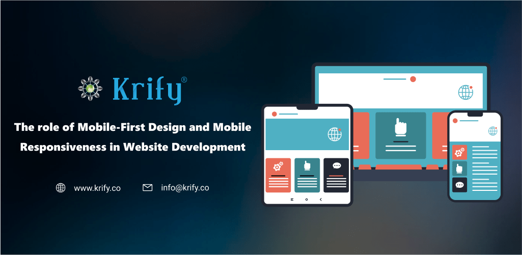
In today’s digital landscape, mobile devices have become indispensable, necessitating a focus on mobile-first design and mobile responsiveness in website development. Companies must prioritize understanding how these principles impact website functionality and user experience amidst evolving technologies and internet infrastructure. In this article, we will explore the significance of mobile-first design and mobile responsiveness, along with the benefits they offer and the challenges they pose, while also delving into best practices for creating a mobile-responsive website, emphasizing the importance of “Mobile Adaptability Solutions.
What is Mobile-first Design?
Instead of creating for desktops first, mobile-first design means designing a website for mobile devices first and then scaling it up to bigger displays. The purpose of mobile-first design is to guarantee that the website is optimized for small-screen devices, particularly smartphones, which are the most often used devices for Internet surfing nowadays. Websites developed for desktop computers are frequently bulky, complicated, and unoptimized for mobile devices, resulting in a bad user experience and decreased engagement rates.
The advantages of a mobile-first design are numerous, including greater website traffic, a better user experience, and a higher SEO ranking. Mobile-first design improves website performance for mobile devices by lowering loading times, simplifying and simplifying the layout, and offering a consistent user experience across all devices. A mobile-first website design also helps to enhance engagement and lower bounce rates by allowing consumers to reach the website fast, easily, and with a favourable experience.
While mobile-first design offers many advantages, one of the most complicated issues is creating mobile responsiveness. The ability of a website to adjust to numerous screen sizes and orientations guarantees that users can access information on any device. Obtaining mobile responsiveness necessitates careful planning, testing, and execution to guarantee that the look and content of the website stay uniform across various screen sizes and that the website loads fast and efficiently regardless of the device.
Website developers should use best practices to enhance mobile responsiveness, such as adopting a responsive design framework, optimizing photos and other media, choosing font sizes that are legible on smaller devices, and removing extraneous components that might slow down the website’s loading performance. Moreover, developers should test the website’s mobile responsiveness on various devices, browser versions, and network circumstances to ensure that consumers have a consistent user experience irrespective of the gadget they use.
Conclusion:
In today’s digital environment, prioritizing mobile-first design and mobile responsiveness is crucial for website development, ensuring increased website traffic, enhanced user experience, improved SEO rankings, and seamless mobile adaptability solutions.
At Krify, we have a team of specialists that are up to date on the newest trends and technology and are enthusiastic about producing excellent solutions that meet our clients’ needs. If you want to learn more about mobile-first design and mobile responsiveness in website development, we have a team of experts that would be pleased to help you. Please contact us for additional details.